UX Recommendations for Bolivia
About this guide
This page will present some resources to help you to provide a better user experience for your customers in Bolivia. The content is divided into three main sections, covering mandatory fields translations, field validation and checkout live suggestions.
If you are looking for an integration guide with mandatory parameters and examples, you can find it here:
Mandatory fields
Below you will find all the mandatory fields, as well the translations for both Field and Placeholder texts.
Personal information
| Field | Translation | Placeholder |
|---|---|---|
| Correo electrónico | ||
| Full name | Nombres y Apellidos | |
| Phone number | Teléfono | Fijo o Celular |
Validation
Below you will find how to validate each mandatory field, preventing user errors and guaranteeing a correct payment processing in Bolivia.
Personal information
| Field name and parameter | Validations | Error messages |
|---|---|---|
| Email payment.email | REGEX: ^[a-zA-Z0-9.!#$%&'*+/=?^_{\|}~-]+@[a-zA-Z0-9]\(?:[a-zA-Z0-9-]{0,61}[a-zA-Z0-9])?(?:\.[a-zA-Z0-9]\(?:[a-zA-Z0-9-]{0,61}[a-zA-Z0-9])?)*$ | Empty field: Este campo es requerido Invalid format: Este correo electrónico parece estar incorrecto |
| Phone Number payment.phone_number | 10 digits Mask: XX XXX XXXXX REGEX: ^[0-9]{5}[0-9]{5}$ | Empty field: Este campo es requerido Invalid format: Este teléfono parece estar incorrecto |
Checkout recommendations
Below you will find live code examples, where you can view and test the checkout experience in this country. Also, you will find recommendations to offer a better experience for your customers.
Personal information
Instructions
- These fields are required for any payment method in Bolivia;
- If the customer provided this information in previous steps, you can reuse it to reduce friction.
Payment method selection

Instructions
- Present all payment methods clearly
- Load the list of payment methods with the first option already selected by default
- Make the selector, being it a card or a radio list, to look clickable
- You can use icons to make the payment method more recognizable
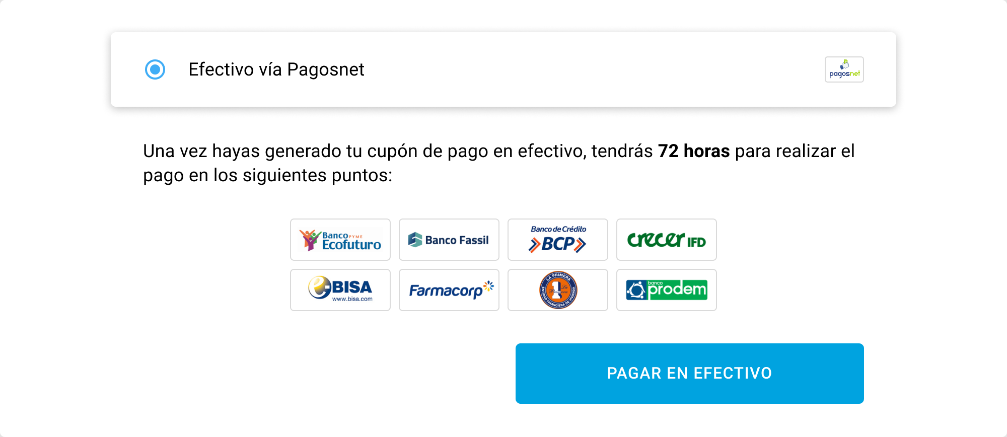
PagosNet selection

Instructions
- You can offer a short explanation when the payment method is selected.
- Inform where the voucher can be paid, whether in text or with images.
- You can use a clear call to action to reinforce the method selection.
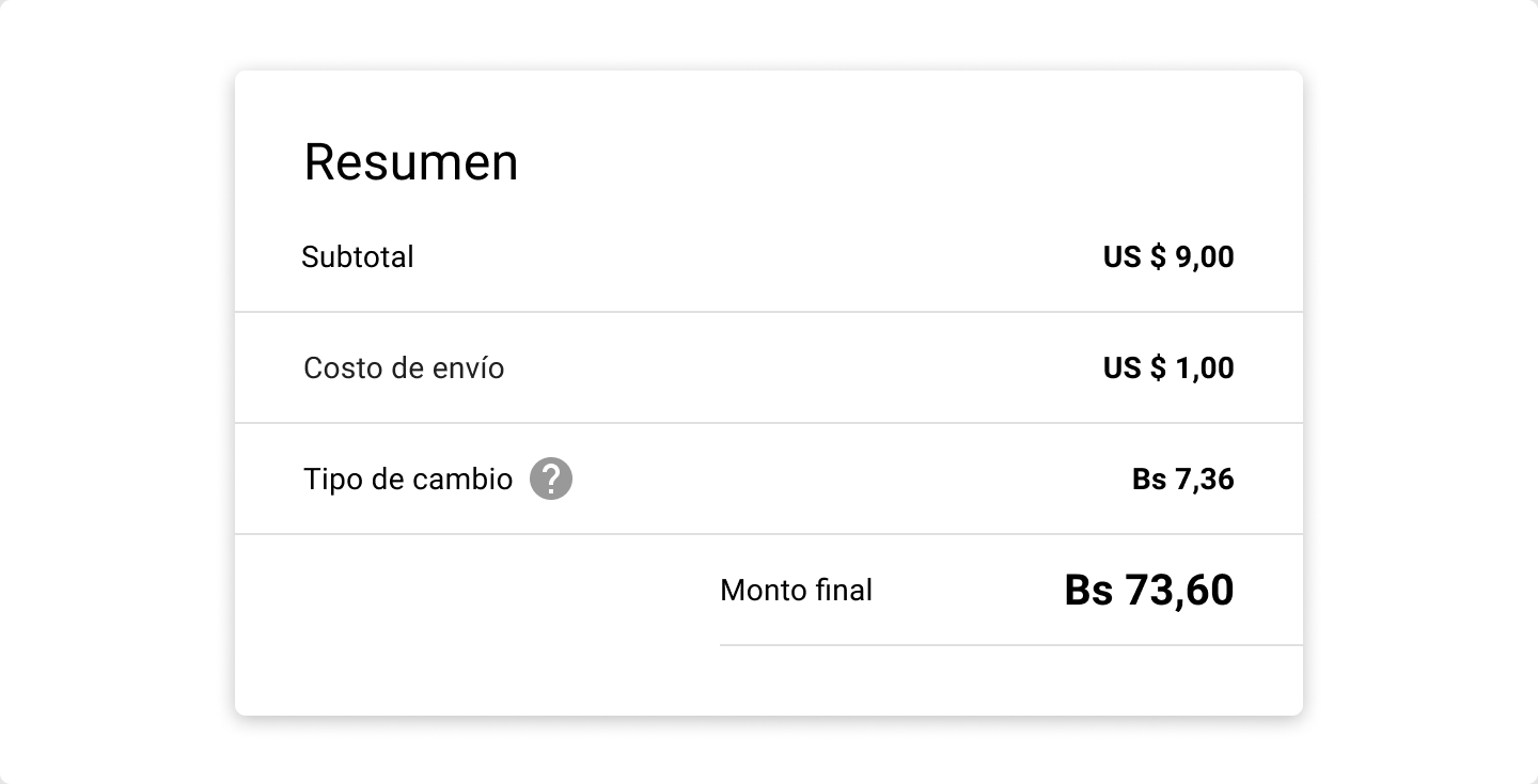
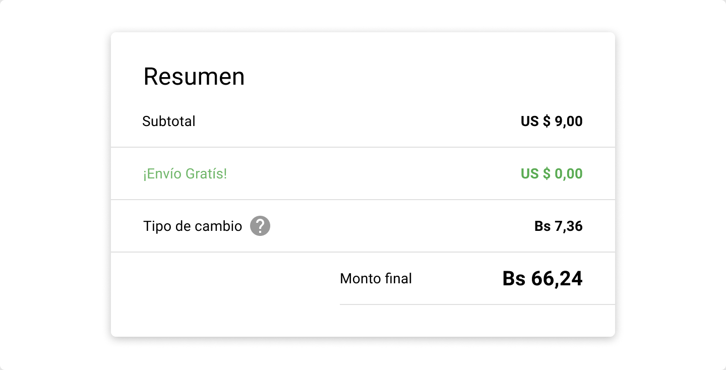
Total order amount
| Regular | Free shipping |
|---|---|
 |  |
Instructions
- Always show values clearly, such as shipping taxes and installment number, preventing surprises
- When dealing with different currencies, pay attention to how you present the difference between then. Also, if possible present exchange rate ("Tipo de Cambio") to the customer.